FitBugg is a location-based fitness app which connects personal trainers with fitness-seeking individuals in their area. Fitness session organisers create events which fitness-seekers book in to and attend. All of this is managed within the framework of the app.
My role
My role began in late February 2014 as UI designer. I was given a basic product specification document outlining desired functionality and tasked with bringing it to life.
The deliverables were logo design, wireframes, high-res mockups, all creative assets sliced up as PNGs and an interactive prototype.
This would provide an iOS developer with a concise development roadmap and a thorough understanding of the app’s business logic.
App architecture
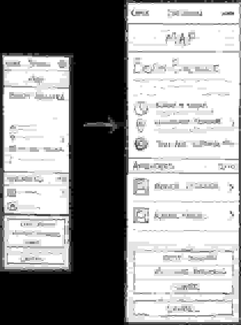
Before opening Photoshop, I began creating a basic system overview (traditionally known as a site map).
This gave me the basis to begin sketching pen and paper UI wireframes.
The app architecture planning process.
Sketching
Once I had sketched low-fi wireframes and established the structure of the app, I began exploring individual screens in more detail.
In most cases the final wireframes and high-res mockups only differed slightly from these initial sketches.
I was able to quickly prioritise important information and set the core visual hierarchy on all screens.
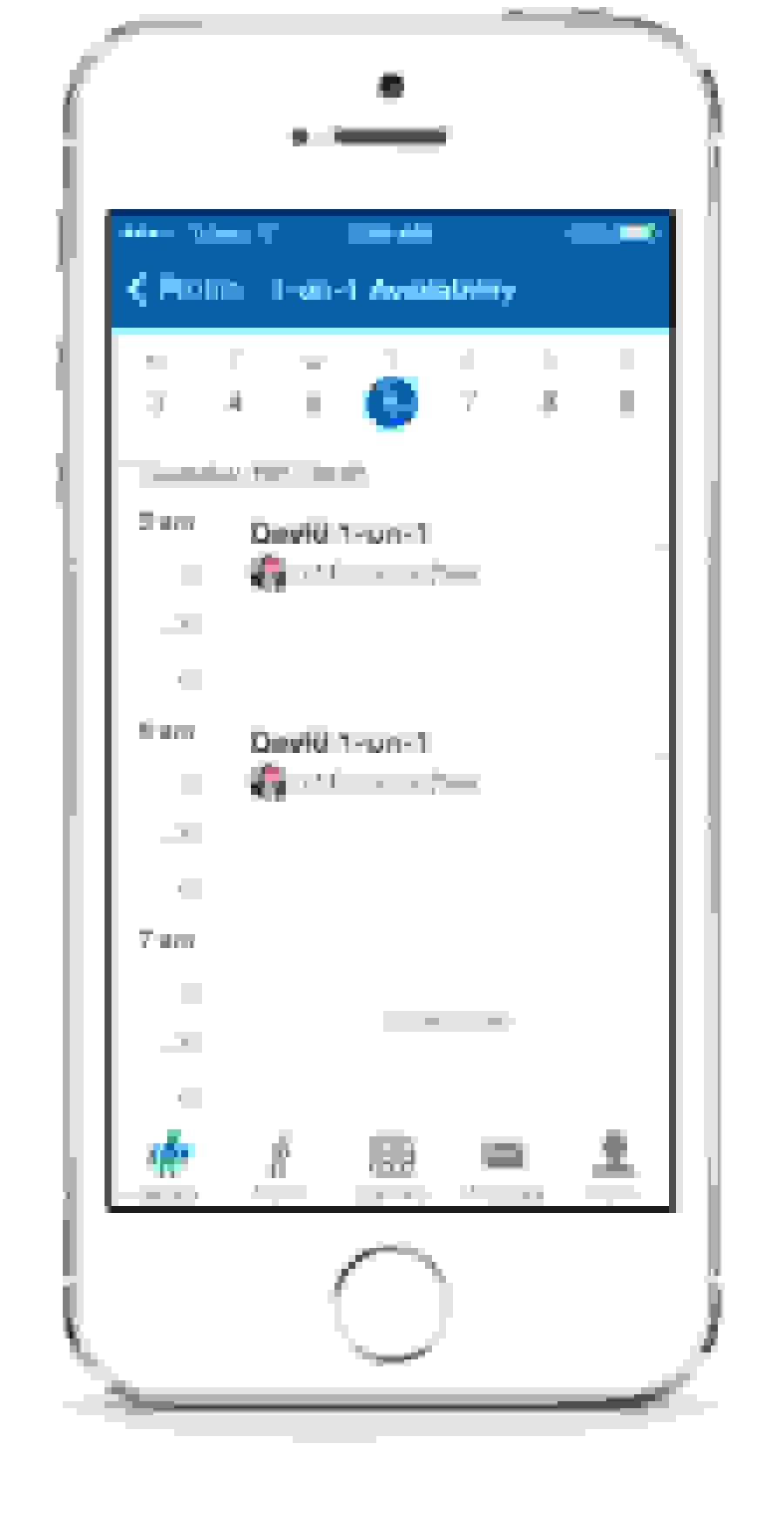
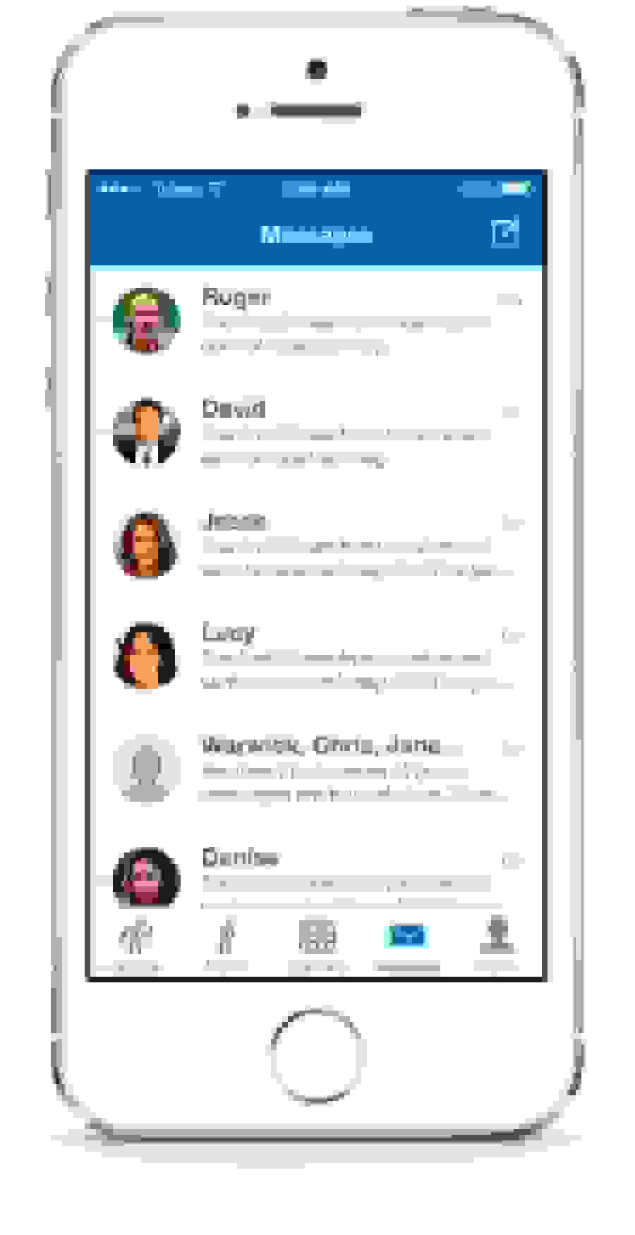
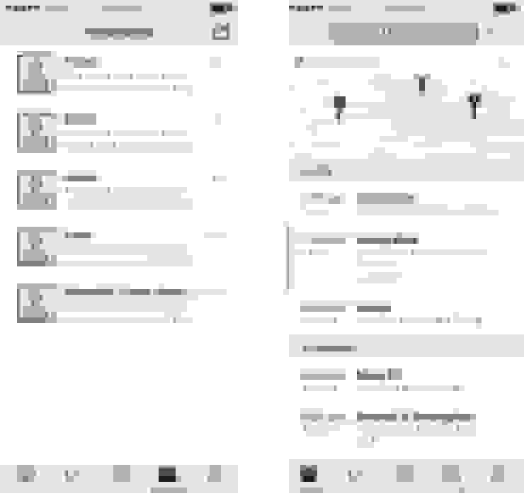
Wireframes
To communicate the fundamental structure of the app and its screens, I created over 100 wireframes in OmniGraffle and compiled them in a detailed product spec document.
I might never speak to the developer of this project so it was important that all features and interactions were explained in detail.
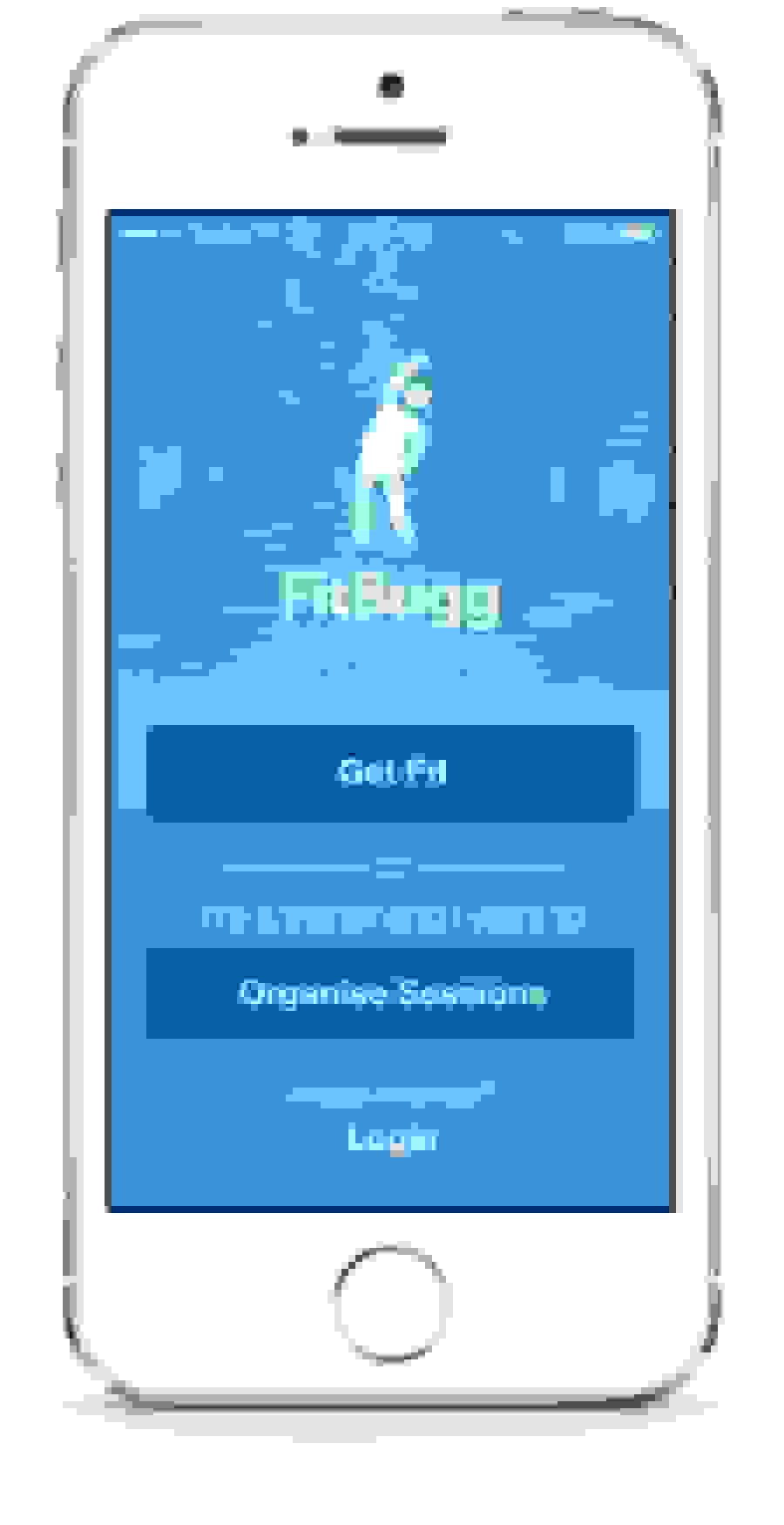
Logo Design
First draft
My initial approach to the logo utilised a dumbbell in combination with a location pin.
This was a cute way to communicate what the app was about, but it was ambiguous and the weight lifting motif was too masculine.
Second draft
My next iteration maintained the location pin, but tackled it from a more human perspective. This was ultimately too feminine and the detail was difficult to make out at low resolutions.
Final concept
Next I further developed the stretching concept, which visually describes exercise in a non-masculine way. We focused on the stretching pose but went with a bubbly, playful stick figure.
The FitBugg brand
In the early going my working colour was a grassy-green which would map to the outdoor park location of many PT sessions. Over time this began to look dull, and in experimenting with the icon we settled on a vibrant blue.
Typography
I wanted the typography to match the fun style of the icon. I mocked up various options but ultimately decided on Museo Sans Rounded because it felt both solid and strong while maintaining the rounded style of the stick-figure.

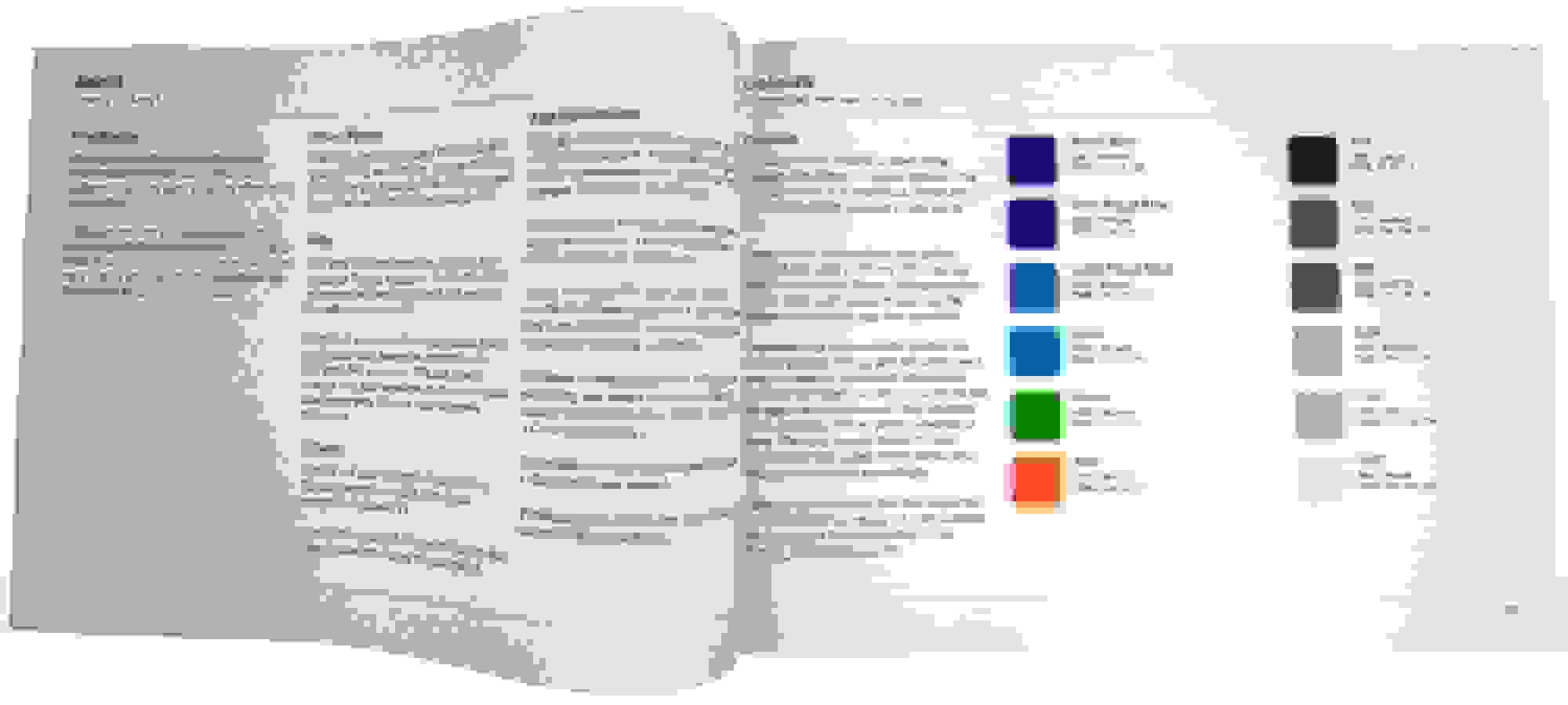
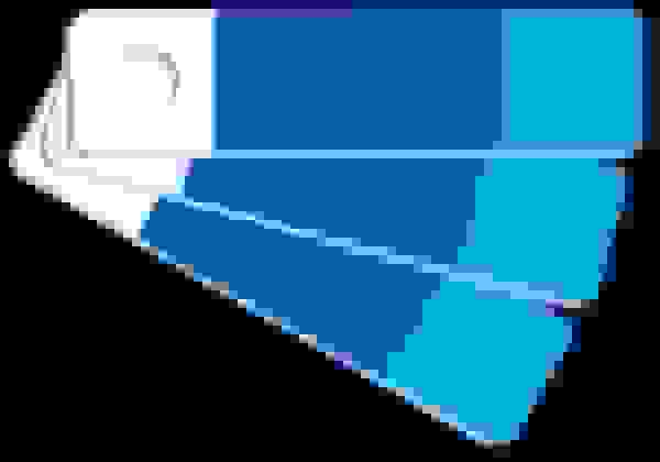
Colours
A colour palette was developed and used throughout the app. This included the blues shown below, along with a suite of blue-tinted grays and success and fail colours.
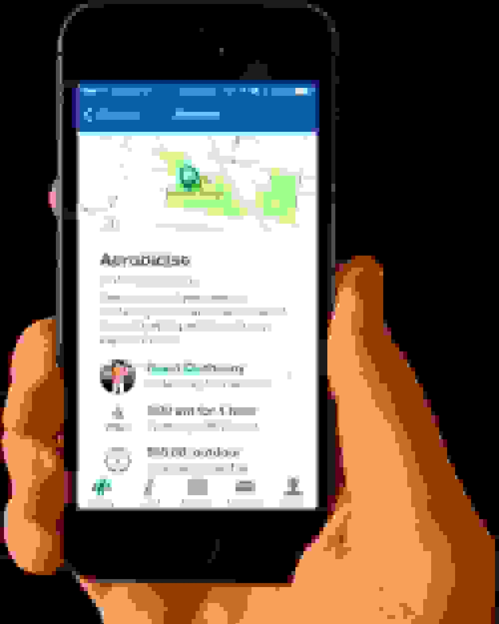
Hi-res mockups
High res mockups were designed using Photoshop, which I’ve used on a daily basis for over 10 years. With wireframes as a guide I was able to move very quickly through all screens.