
Back story
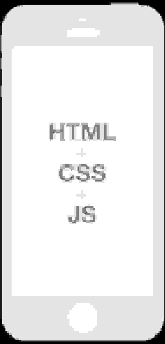
ESPN Australia have a suite of four live score apps on iPhone and Android. They were previously written in HTML, CSS & JavaScript and housed in a native app shell.
The content in the apps was good but the interface and UX let it down. In 2013, we decided to build native apps and were able to explore UI functionality not possible using web technology.
The “Now” brand
Each of the four apps are branded with a unique colour which flows through the app’s UI and creative assets.
A player silhouette helps communicate the sport and distinguishes one app from the other while at the same time visually tying them together.
A-League
Football Now

NRL
League Now

AFL
Footy Now

Super Rugby
Rugby Now

Sections
In our initial launch there were six sections.


Sketching
Sketching is a crucial part of my work flow. I use the Behance Dot Grid Book. Sketching helps me quickly iterate UI / UX concepts without the distractions of Photoshop.
In the Scores sketch, I stacked teams and scores above one another rather than centre-aligning them on the same row. This made scanning scores faster and easier.
Cards
I began to explore a card metaphor. In the Stats sketch I try hinting at a swipe gesture by showing the edges of the left and right cards.
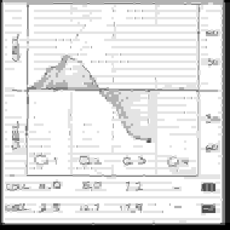
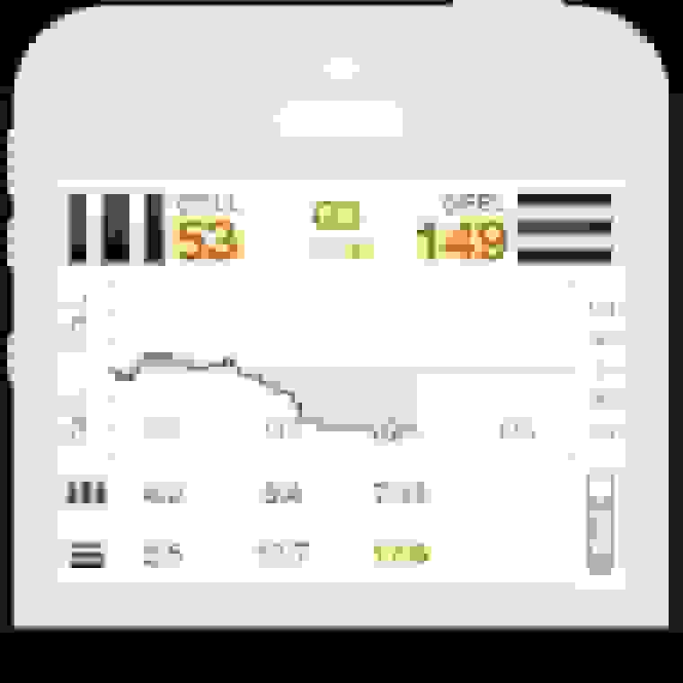
Score worm
The score worm is a key UI element which describes the flow of play in AFL, NRL and Super Rugby. It visually communicates which team is winning and by how much and is very common in live score apps.
I tried to improve the design by vertically aligning the worm and the quarter-by-quarter scores below it.
Video demo
To help communicate the proposed functionality of the app, I produced a Flash-based walkthrough of the scores and menu screens.
This was shared with our dev team, internal stake-holders and the app developers we worked with.
Designing with cards
The online world is currently being re-imagined with ‘cards’ as a primary visual metaphor.
The power of cards lies in their ability to visually associate related chunks of content, while at the same time differentiating them from other similar groupings of content.


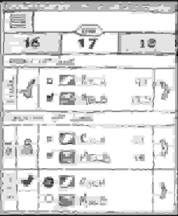
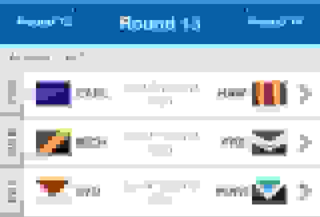
Swiping gestures
One of the most common use-cases in the apps is moving between rounds. Previously this was achieved using two buttons in the app’s toolbar. Moving from one round to the next was a painful user experience.
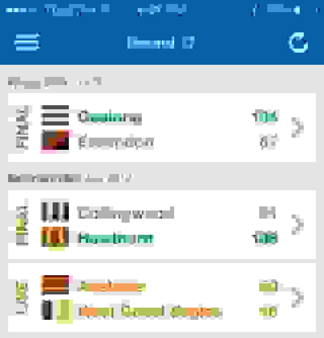
First draft
With native gestures we could replace actual buttons with swiping gestures and save screen real estate. Great!
Except that in early beta tests users didn’t know how to move from one round to the next. This was a big problem.
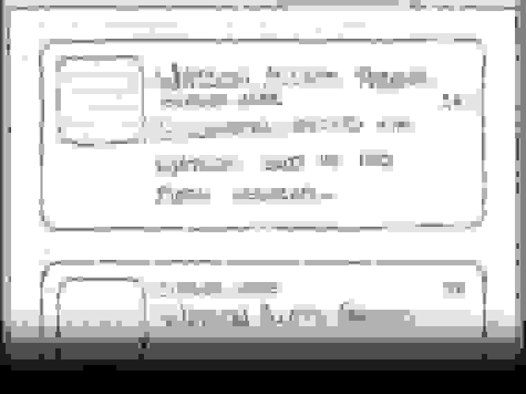
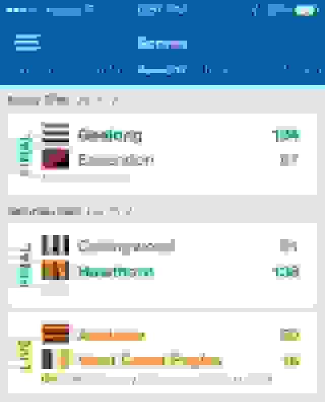
Second draft
Keen to preserve screen space but also provide a visual aid for users, we added tappable round titles.
Users could still swipe between rounds, and to hint at the swiping gesture, tapping a round title would trigger the sliding animation.
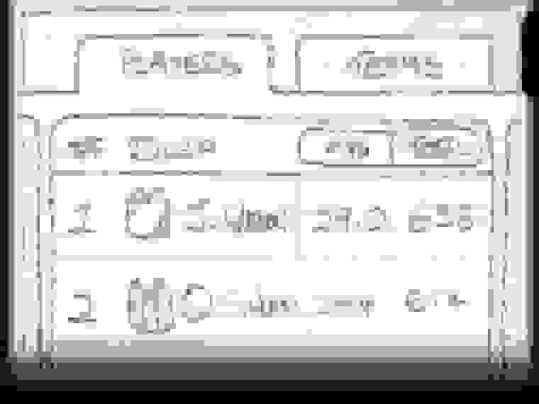
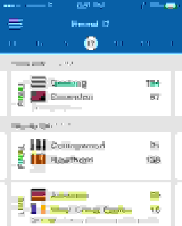
Final result
However, the hit-state of the buttons was too small to comfortably tap and the repetition of the word “round” was unnecessary.
The round titles were replaced with larger numbers and the edges of the neighbouring round’s cards were shown to suggest more content.
Notes
I would like to make special mention of the ESPN Australia team whose hard work and collaboration was invaluable to the success of this project.
Also, a special thanks to the guys from WeMakeApps who were a pleasure to work with. I can personally recommend them if you need help with your iOS or Android development project.