
Rust’s menu interface is in need of an overhaul. The most heavily used screen — the server browser — functions the most poorly of all, so I’ve had a crack at improving it.
It’s difficult to find a server in Rust. When you find yourself using a 3rd party website (shouts to battlemetrics) to find a decent server something is clearly up.
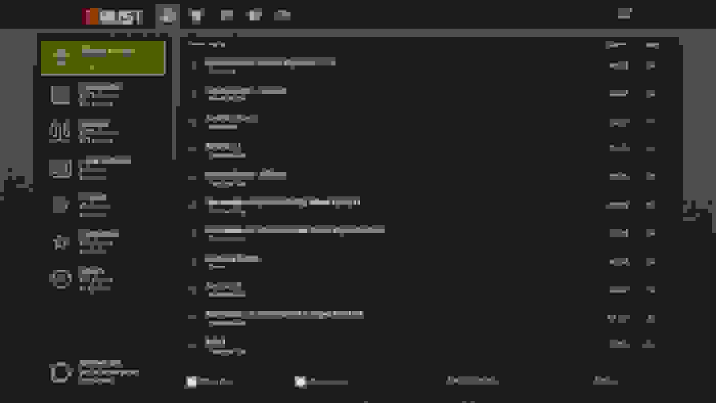
Server browser redesign
Here’s my attempt at improving the server browser:
What’s the difference?
Here’s a summary of what I’ve done:
- Added truncated server description.
- Added time since last wipe column (wiped).
- Added some additional server filters.
- Added map size for each server.
- Added Steam friend count for each server.
- Removed player and server counts from server type icons.
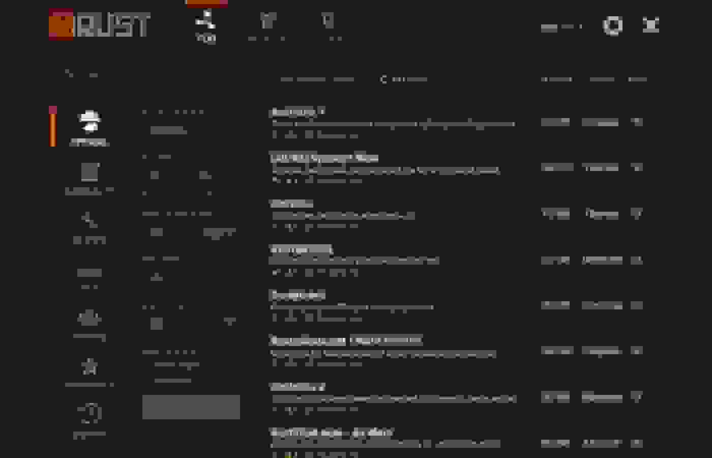
For reference here’s the server browser at the time of publishing:
Time since last wipe
Recently wiped servers are currently difficult to find. Server owners are forced to add a time stamp of their last wipe near the beginning of their server name as a kind of click bait. They can add that info in the description but that’s currently a whole entire click away in a popup.
What most people are looking for is a server which recently wiped so there’s a level playing field. In addition to being able to sort by most recent wipe date, I’ve added a “Max server age” filter so only servers wiped in the last X days / hours will show. This would allow servers wiped in the last day to be shown, sorted by lowest ping.
NOTE: Facepunch are trying to phase out wipes but in the mean time this is a much needed feature.
Server filters
Hopefully these are all self-explanatory but here’s what I’d added:
- Player count filters. This is a great one from battle metrics and I usually set it to ~10 to weed out dead servers.
- Max server age. This is explained above.
- Max ping so you don’t have to see slow AF servers.
The rest are existing features but they’re all in one place now.
Individual server screen
I had a quick go at the individual server screen. The current popup is too small and it’s annoying AF not being able to read the full title.
Check it out:
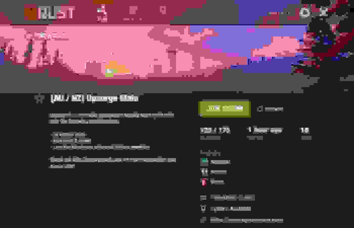
What’s the difference?
Here’s what I’ve done:
- Added “favourite” functionality.
- Added time since last wipe.
- Added list of Steam friend’s on this server.
- Added map size.
- Added server geo location.
The rest are existing features re-organised.
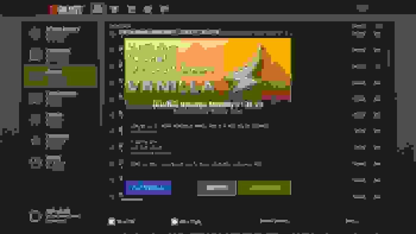
Again, for reference here’s the current server popup:
Hope you dig it.
Comment if you’ve got any other ideas or feedback.

Leave a comment